


Slider Revolution WP
09.27.2016


For version 5.0+, this can now be easily achieved with Static Layers and Actions.
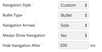
To use Custom Navigation styling of the bullets, navigation buttons open the slider settings and change the Navigation Style to Custom.
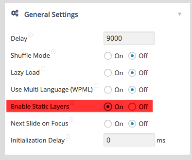
To add custom Stop and Play buttons, we will need to enable the Static Layers in the Slider settings:
To use Custom Navigation styling of the bullets, navigation buttons open the slider settings and change the Navigation Style to Custom.
To add custom Stop and Play buttons, we will need to enable the Static Layers in the Slider settings:
Once this done, we need to create the Buttons in the Static Layers with adding a Layer with the following Markup i.e.:
|
1 2 3 4 5 6 7 8 9 10 |
<div class="playstopholder"> <div class="playstopbutton"> <i id="mypausebutton" class="eg-icon-pause"></i> </div> <div class="playstopbutton"> <i id="myplaybutton" class="eg-icon-play"></i> </div> </div> |
Make sure you set the Layer visibility from the first slide to the last slide.
The Classes .playstopholder and .playstopbutton will help us to style the slider, and the id’s #mypausebutton and #myplaybutton will help us to controll the Slider API.
Note ! In the Backend we will not see the style elements, however it is ok, since the style addon will come due some custom stylesheet in the slider settings.
Open the Slider Settings and add the following style settings to the Custom CSS Field to style your Play / Pause buttons:
|
1 2 3 4 5 6 7 8 9 10 11 12 13 14 15 16 17 18 19 20 21 22 23 24 25 26 27 28 29 30 31 32 33 34 |
.playstopholder { background:#ecf0f1; padding:5px !important; } .tp-caption .playstopbutton { display:inline-block; color: #62a8a0; text-decoration: none; background-color: #fff; border-radius: 50%; -webkit-border-radius: 50%; -moz-border-radius: 50%; border: 3px solid #fff !important; text-align:center; margin-right:5px; font-size:10px !important; } .tp-caption .playstopbutton { line-height:13px !important; font-size:10px !important; } .tp-caption .playstopbutton i:before { color:#E03301; } .tp-caption .playstopbutton:hover, .tp-caption .playstopbutton.selected{ border-color:#E03301 !important; } |
To Style the Bullets and navigation buttons, please extend the Custom CSS Field with the following settings:
|
1 2 3 4 5 6 7 8 9 10 11 12 13 14 15 16 17 18 19 20 21 22 23 24 25 26 27 28 29 30 31 32 33 34 35 36 37 38 39 40 41 42 43 44 45 46 47 48 49 50 51 52 53 54 55 56 57 58 |
.tp-bullets { display:block !important; opacity:1 !important; background:#ecf0f1; padding:7px 7px 0px } .tp-bullets .bullet { display:inline-block; background-color: #7f8c8d; border-radius: 50%; -webkit-border-radius: 50%; -moz-border-radius: 50%; border: 3px solid #ecf0f1; text-align:center; width:17px !important; height:17px !important; margin-right:2px !important; } .tp-bullets .bullet:hover, .tp-bullets .bullet.selected { display:inline-block; background-color: #fff; border: 3px solid #E03301; } .tparrows.default.custom { background:#fff; border-radius:50%; border:3px solid #fff; } .tparrows.default.custom:hover { background:#fff; border-radius:50%; border:3px solid #E03301; } .tparrows.default.custom:before { font-family: "eg-font"; font-style: normal; font-weight: normal; position:absolute; padding:4px 10px; color:#E03301; font-size:25px; } .tp-leftarrow.default.custom:before { content: '\e824'; } .tp-rightarrow.default.custom:before { content: '\e825'; } |
|
1 2 3 4 5 6 7 8 9 10 11 12 13 14 15 16 17 18 |
revapi1.bind("revolution.slide.onloaded",function (e) { jQuery('body').on('click','#mypausebutton',function() { revapi1.revpause(); jQuery('#mypausebutton').parent().addClass("selected"); jQuery('#myplaybutton').parent().removeClass("selected"); }); jQuery('body').on('click','#myplaybutton',function() { revapi1.revresume(); jQuery('#mypausebutton').parent().removeClass("selected"); jQuery('#myplaybutton').parent().addClass("selected"); }); jQuery('#myplaybutton').parent().addClass("selected"); }); |
We are waiting till the Slider is loaded, and make sure that the click events act always, also it the button has beed removed/readded etc during the runtime.
Please also check our FAQ here: https://www.themepunch.com/faq/api-example-adding-a-playpause-button/

